If you picture 420-themed clothing from a decade ago, a certain look probably comes to mind: leaf prints, tie-dye, red-yellow-green color blocking, maybe a cartoon character with heavy eyelids. That aesthetic did not come from nowhere, but it also is not where the culture has stayed.
Here is how the look actually shifted, and what it says about where the category is headed.
The Old Playbook
Early 420 merchandise borrowed heavily from a narrow set of visual shortcuts: leaf silhouettes, tie-dye, and Rasta color palettes, regardless of whether they had any real connection to the wearer. It was easy to produce and easy to recognize, which made it common on cheap, mass-produced gear. It also flattened a genuinely global culture into one repeated visual joke.
What Changed
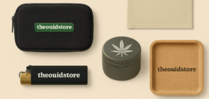
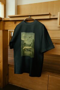
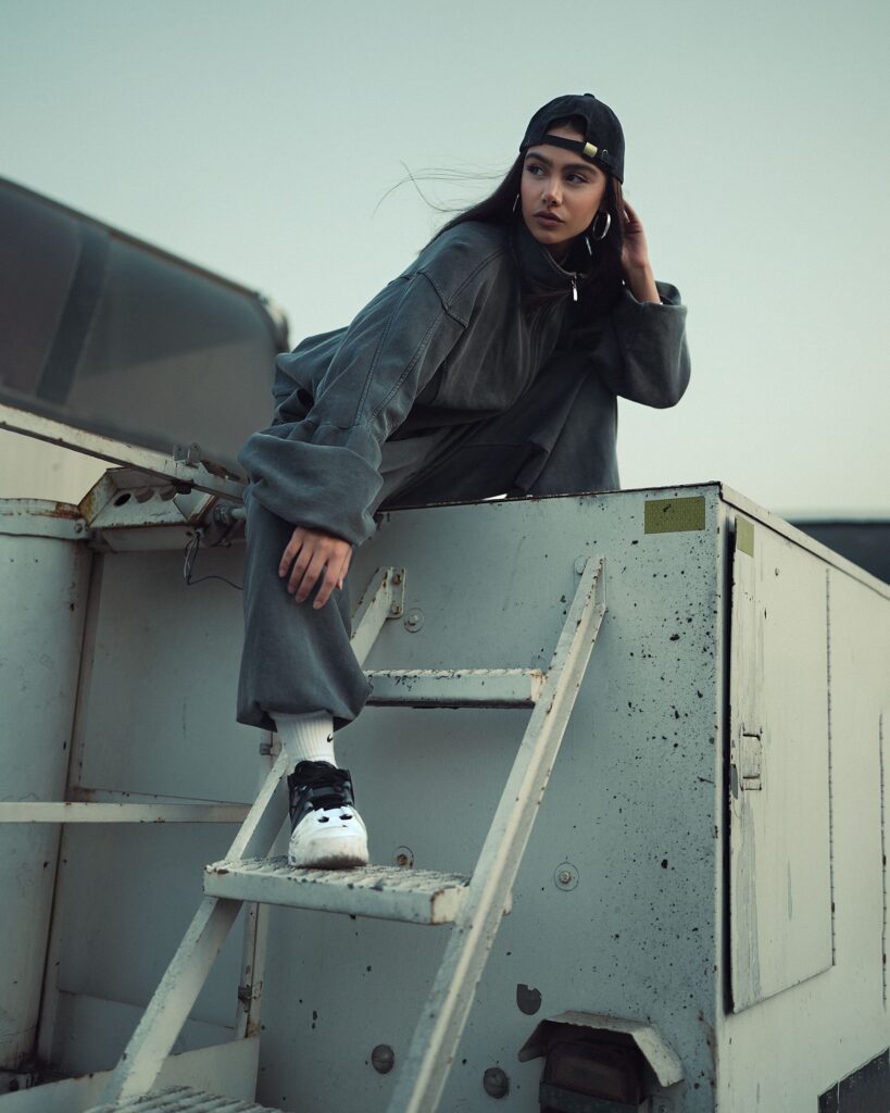
As streetwear grew into a serious design category of its own, with brands built around typography, silhouette and material quality rather than novelty graphics, 420 apparel started borrowing from that world instead. Muted palettes, small logos, and considered fabric choices replaced loud prints. The shift mirrors what happened in skate and surf apparel a generation earlier: niche interest gear that eventually earned a place next to general streetwear because the design quality caught up.
Design Cues to Look For Now
- Small, considered branding instead of oversized graphics covering the whole garment.
- Heavier, better fabric that holds its shape after multiple washes.
- Color palettes that could work in any streetwear drop, not just green and yellow.
- Cultural references used with intent, rather than a stereotype dropped in for recognition.
Why This Matters Beyond Fashion
The visual maturity of a category tends to track with how seriously it is taken. As 420 apparel design has caught up to general streetwear standards, buyers now expect the same build quality and design intent they would expect from any other clothing brand, not a discount because of the subject matter. That expectation is part of what pushes the whole space forward.
The Takeaway
The leaf-print era was a starting point, not a ceiling. The current direction favors quality materials, restrained graphics and design that holds up outside the niche it came from, and that shift is a sign of a maturing category rather than a passing trend.
See where this shows up in practice in The Ouid Store’s Apparel collection.